Scope of this client story
- MISSION / VALUE PROPOSITION
- BRAND DEVELOPMENT
- IMAGE DEVELOPMENT
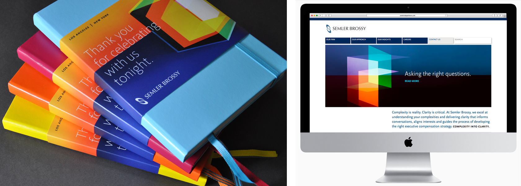
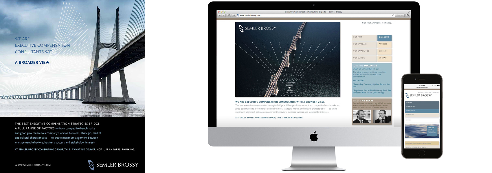
- WEBSITE
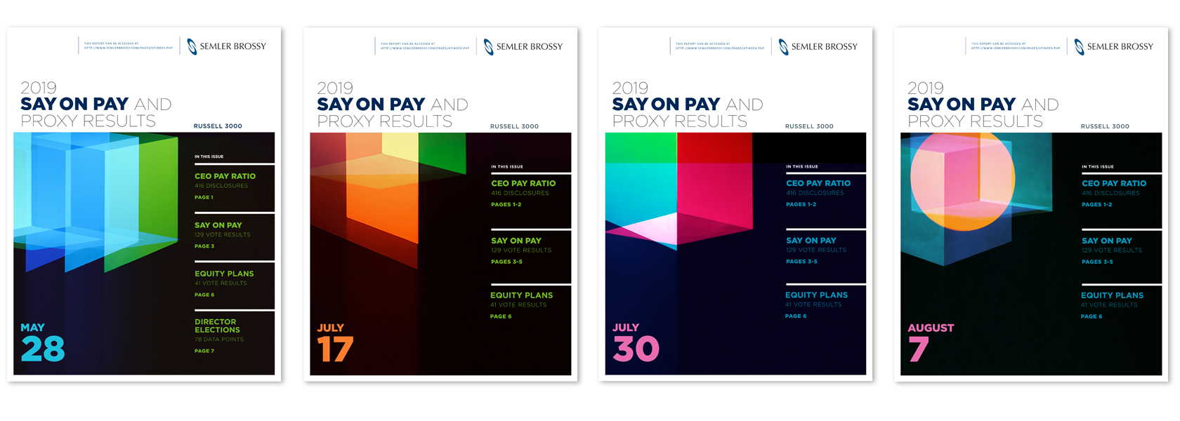
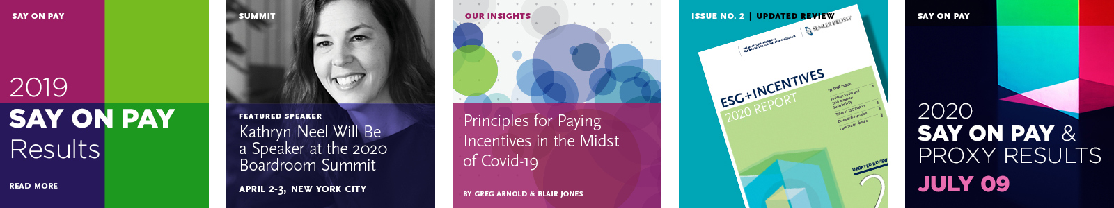
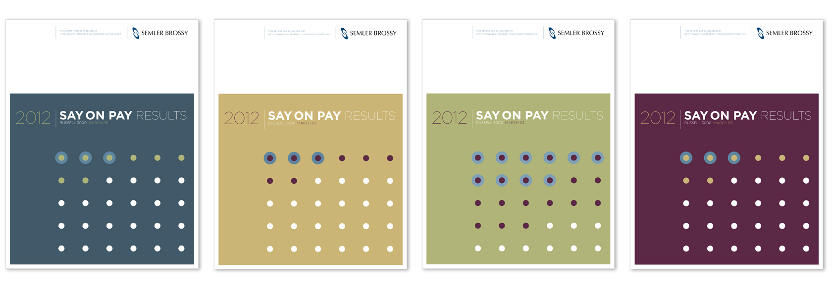
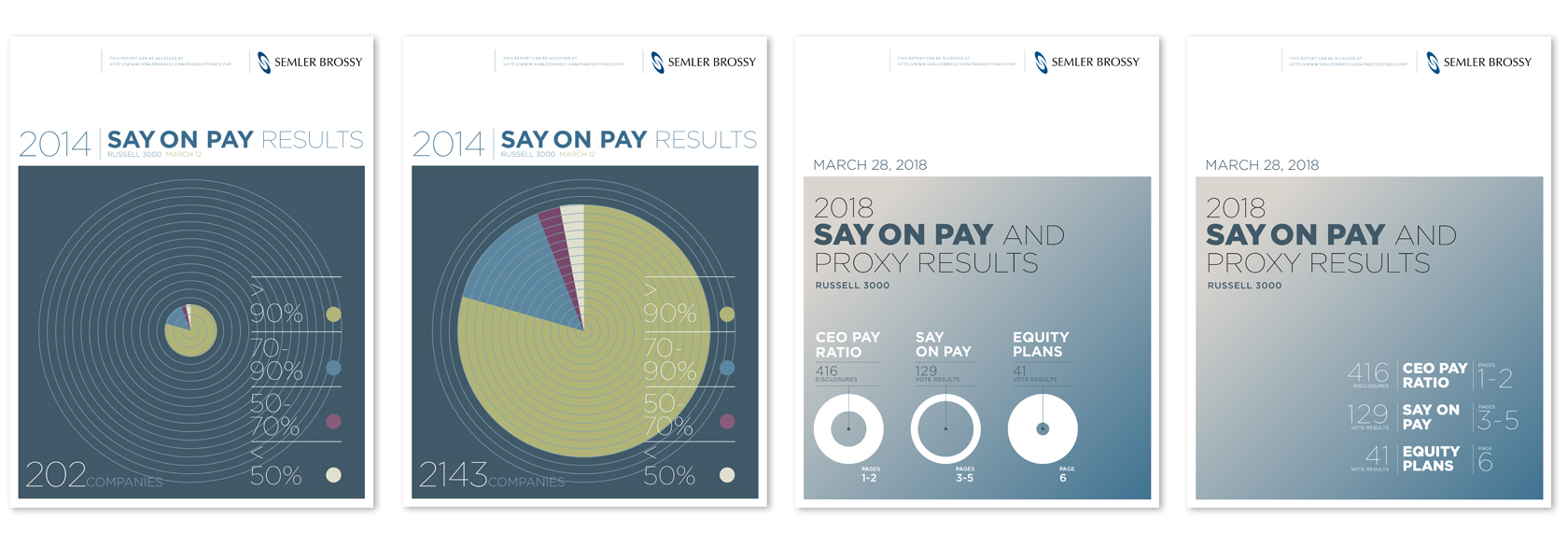
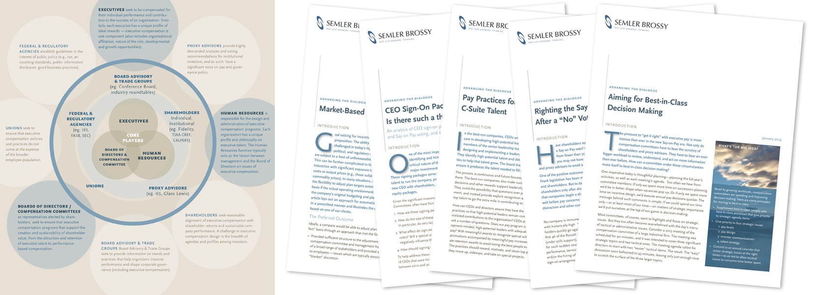
- WHITEPAPERS & REPORTS
- E-MAGAZINE
- VIDEO & MOTION GRAPHICS
- TRADE SHOW EXHIBITS
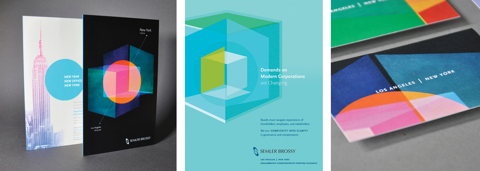
- SIGNAGE & EPHEMERA
- ADVERTISING / SOCIAL MEDIA
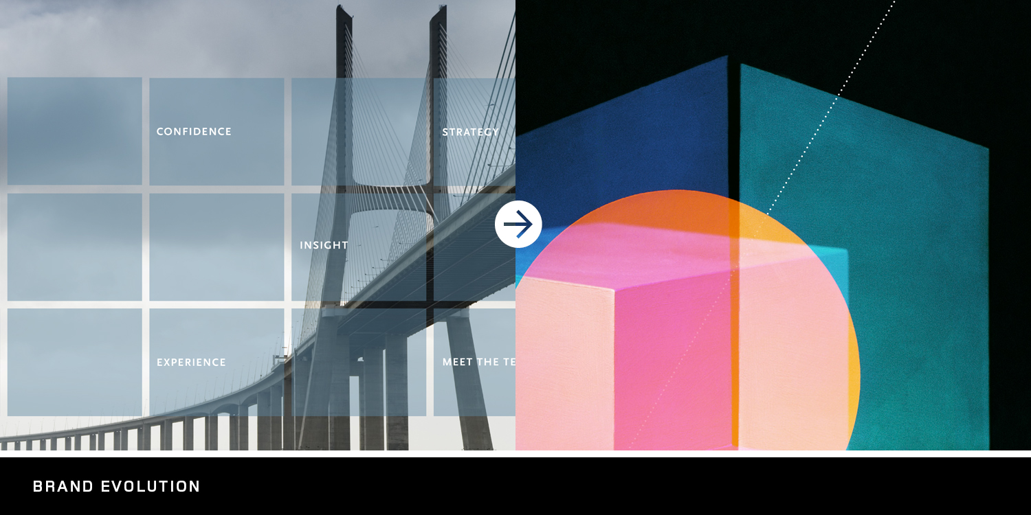
We have been asked to brand Semler Brossy twice over our long partnership, refining both message and aesthetic to best align with their evolving position in the market. Initially, their purpose was focused on finding solutions that could bridge the gaps inherent between boards, management and candidate expectations — by adopting a broader perspective. Visualized through “bridges over vast expanses”, we reflected their unique ability to see the big picture and offer solutions that could manage difficult conversations through open dialogue with key players.
As the firm matured and became bolder in both its size and intellectual capital output, it became time for a shift in their brand presence. Additionally, it seemed the whole of the consulting industry had settled into an expected aesthetic — a monochromatic palette and imagery that evoked literal business subjects or vague concepts of navigation or relationships. Semler, a comparatively small firm, but with a large presence in their space, wanted to break free from the expected and communicate their evolved approach — with distinction. The senior partner added the challenge of finding a visual solution that their competitors could never own.
Partner interviews assisted in developing a message that would distill their rising success down to a simple but powerful deliverable, Complexity into Clarity. Visually, we challenged ourselves to explore less expected ways to illustrate this idea, while also reflecting the vibrancy of this modern firm and its young and enthusiastic team members. It was a small collection of art hung in their new offices that seeded the idea of considering fine art to visualize their brand.
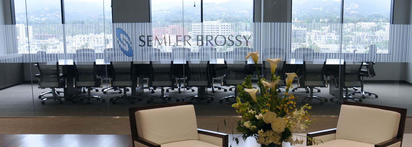
It was the work of a Canadian artist that provided the perfect balance of simplicity, energy and professionalism that would define the new brand. Exclusive use of five works over a 5-year period was negotiated to create a foundation for the new brand visual language. The additional purchase of two large installations from the artist, now hung in the lobbies of their LA and NYC offices, culminated in a full circle brand investment for the firm’s employees and client visitors. They are thrilled with the results.